Build Shadcn themes from a real color scale
Choose the Radix Color palette, keep the Shadcn API. Same components, better color decisions behind them.
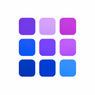
Start from color scales that already know their job.
Pick Radix families for neutral surfaces, brand actions, accents, states, and charts. Radixcn translates those 1-12 steps into the shadcn token contract.
Custom palettes are inspired by Radix Colors custom palette: one color becomes a full scale, then each semantic token gets a deliberate step.
Keep shadcn compatible without giving up your token system.
Bridge mode is a compatibility layer for teams with an existing design system. Your components still read --primary, --background, --ring, and --font-sans, while those variables resolve to semantic aliases in your product tokens.
Every shadcn token gets a deliberate Radix step.
Radixcn preserves the API your components already use, then maps each token to the scale step that fits its role.
The result is predictable CSS: surfaces stay quiet, text stays readable, actions stay prominent, and focus states stay visible.
Ready to generate a theme?
Pick a Radix color family or generate a custom 1-12 palette, then copy fixed shadcn CSS or bridge it to your system.